
Power Protect Data Manager (PPDM) Reporting


View the interactive prototype
Impact
Improved reporting usability and increased adoption by 20% among enterprise users
Team
UX Designers (HFI)
Dev Team (Dell In-house)
Timeline
12 Months
2023-24
Project Overview
Redesigned how users access, understand, and download backup reports more easily.
My Role in the Project
Led user workshops and redesigned the reporting flow for better usability.
What is PPDM?
We often hear about Data Protection, but what does that mean in practice? That's where Dell PPDM comes in.
What is PPDM?
It’s a smart data protection tool designed to help businesses secure, manage, and recover their critical data seamlessly.
Why do businesses trust PPDM?
It protects valuable digital assets through reliable backup and recovery solutions across physical, virtual, and cloud environments.
What is Dell Reporting?
It’s a feature within PPDM that generates reports on backup activity. These reports offer businesses a clear picture of their data protection, helping them stay informed and proactive.
1
Talking to Customers
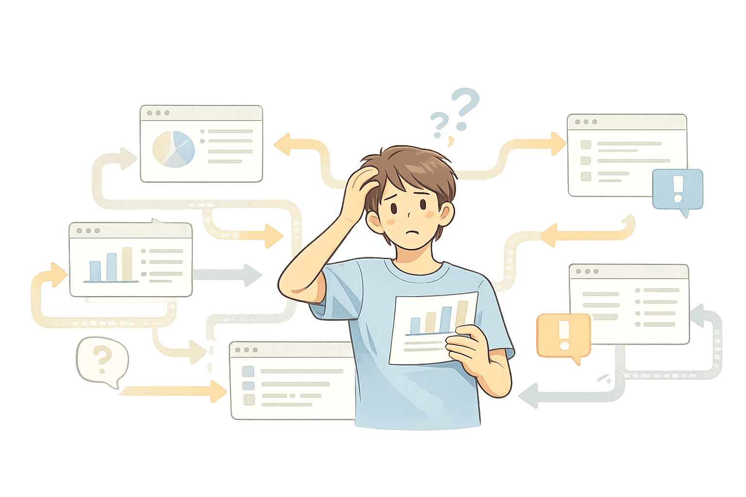
Why Are Clients Turning Away from PPDM Reporting?
When we spoke with our clients, we uncovered a surprising insight: the PPDM reporting feature was underutilized.
Instead, clients like Walmart, Presidio, and Duke Energy were relying on alternative software solutions like Veeam and DPA to meet their reporting needs.
This highlighted a significant gap - PPDM's reporting feature wasn’t meeting user expectations, pushing them to look elsewhere.
2
Key Issues & Insights
Unclear Navigation
Confusing terms in navigation items made it hard for users to find reporting features.

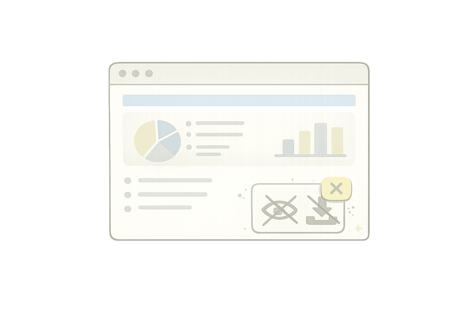
Missing Report Previews
Users couldn't preview reports before generating them, leading to wasted time and frustration.

Limited Templates
Only a few pre-made templates were available, making it hard for users to meet their reporting needs quickly.

Inability to Edit Reports
Once created, reports couldn’t be edited or reused, limiting flexibility and efficiency.

Key Insights that shaped Design Decisions
Complicated
Process & Navigation

Lack of
Proper Templates
Missing
Basic Functionalities
3
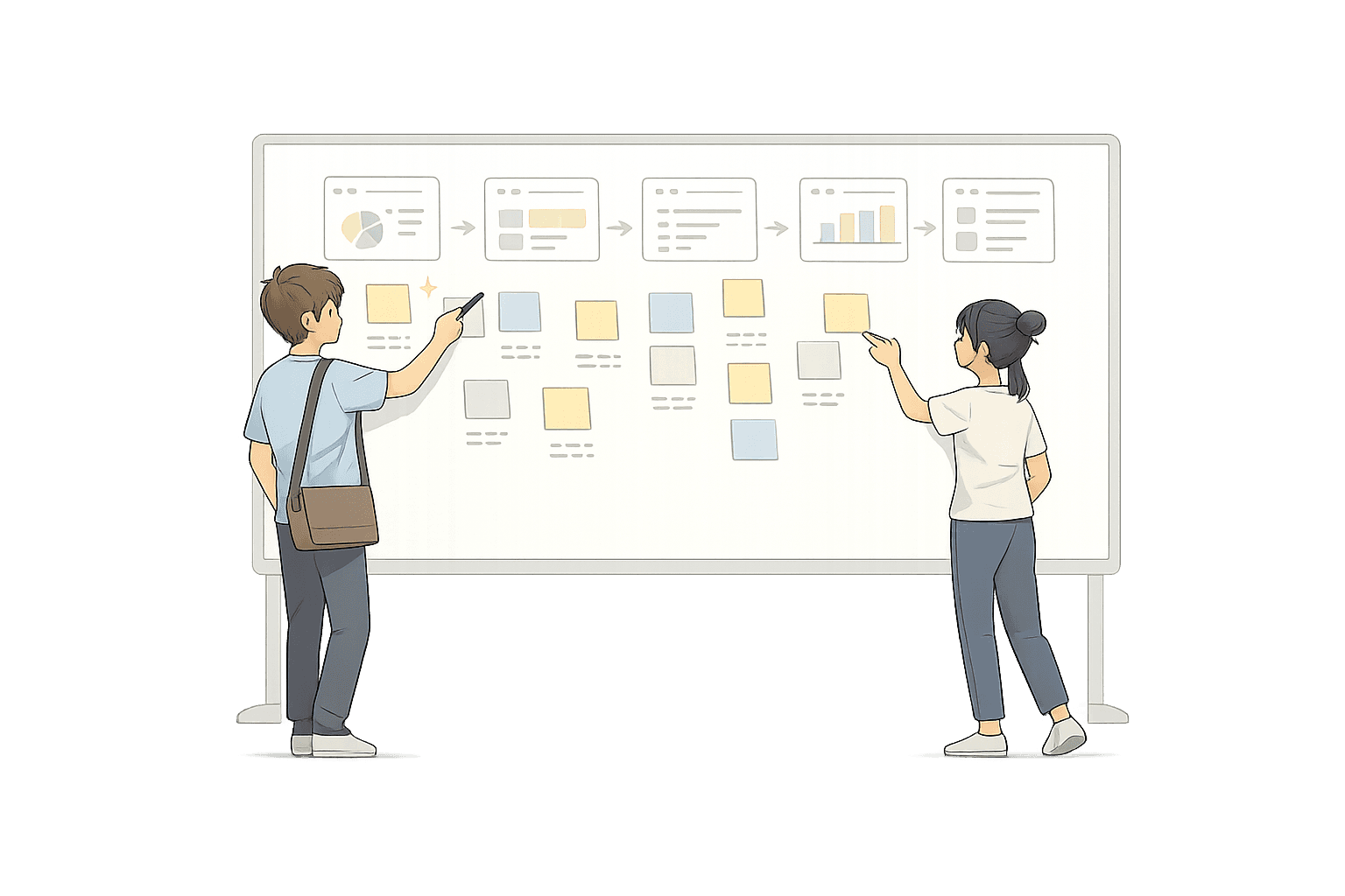
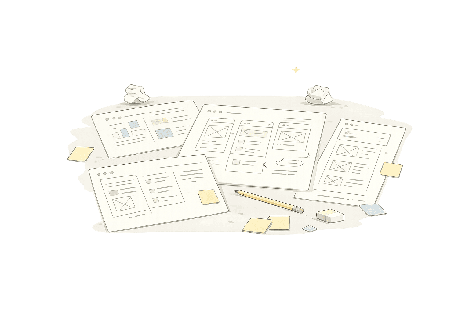
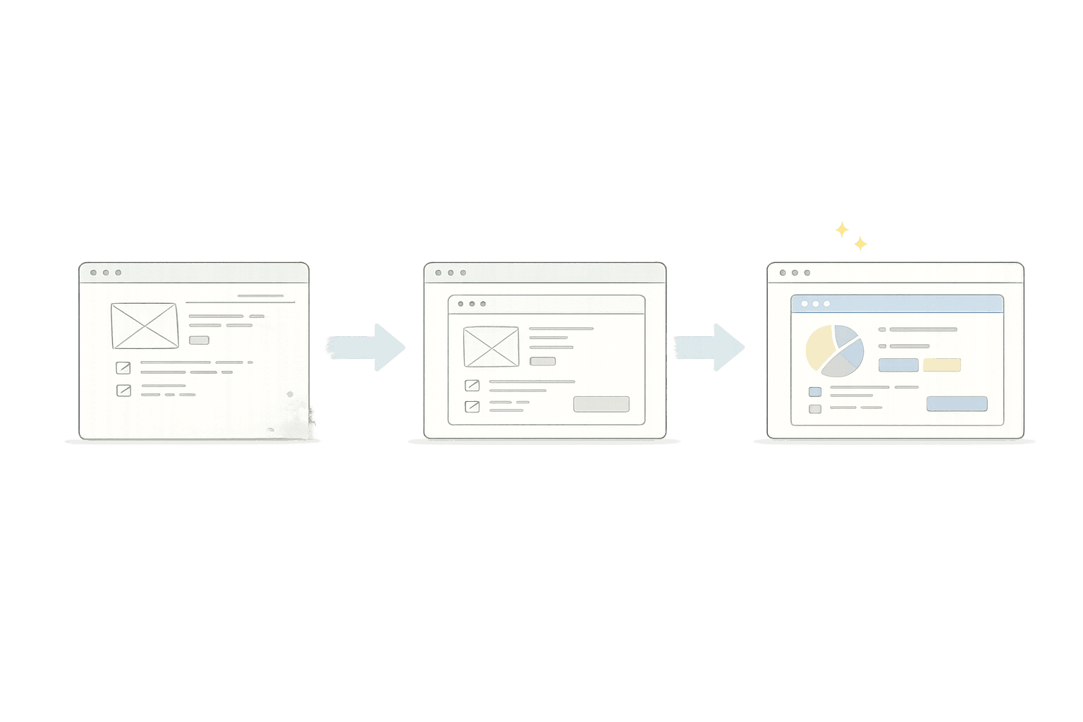
Our Redesign Process
4
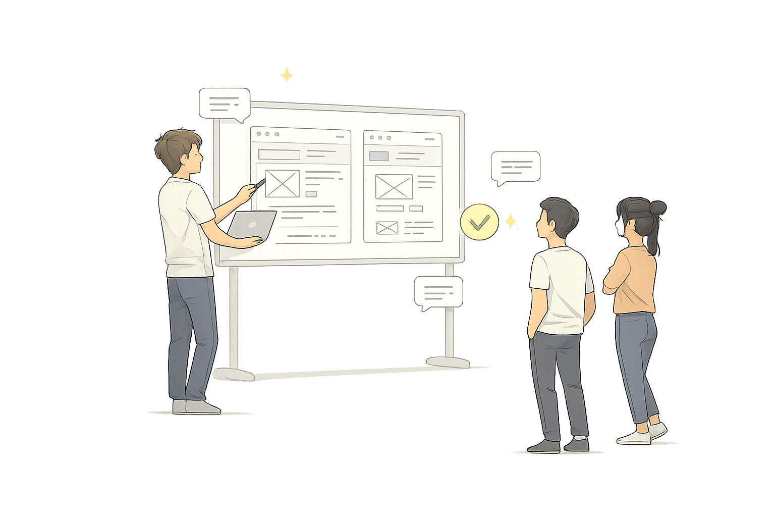
Final Designs
After many iterations and user feedback, our solution evolved into four key features.
Report Preview
Users can now preview their reports in real-time, saving time and avoiding errors.


Report Download
Users can choose formats like CSV or PDF effortlessly with just a few clicks.


Template Creation
Users can now create and save customized templates for recurring needs.


Report Customization
Users can edit existing reports on the fly to suit their specific requirements.


View the interactive prototype
5
Reflection & Outcomes
Key Takeaways
Healthy Communication is Key:
As a design lead, I learned the value of open and active conversations with stakeholders.
Actively listening and knowing when to push back led to better collaboration and solutions.
Direct Client Interaction:
Engaging directly with clients gave me invaluable insights into pain points we hadn’t previously considered.
This experience highlighted the importance of stepping beyond secondary research and directly understanding user needs.
Outcomes
Increased Adoption:
Within the first month, 20% of clients began actively using the redesigned Dell Reporting feature.
By the third month, this number increased to 42%, showcasing the effectiveness of our user-centered redesign.
Enhanced Client Satisfaction:
Post-launch surveys showed a 27% increase in user satisfaction scores, indicating a positive reception to the redesign.
Better Insights for Businesses:
The new report preview and customization features helped clients make quicker, data-driven decisions, enhancing their workflows.
This project helped me improve client experience and also strengthened my skills in
client communication, iterative design, and managing cross-functional teams.